Posted June 15, 2026

By Enrique Abeyta
The Melt-Up Case Makes Itself
We’re on the verge of what could be a massive stock market melt-up.
If you’ve followed me for any time at all, you have probably heard me say that before.
Just last week, I wrote to you outlining my case for the current bull market.
There are plenty of factors that support this idea, some of them fundamental and others more macroeconomic.
But the most powerful of all the signs for a melt-up are historical technical patterns.
Over the past several weeks, I’ve seen dozens of these indicators come up that all point to the same conclusion…
This bull market looks like it has at least another year to go. And the upside from here may surprise you.
Today, I wanted to run through some of these technical indicators. After reviewing them, I think you’ll see why I feel so strongly about a potential market melt-up.
All Evidence Points to the Same Thing
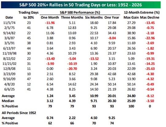
Source: Bespoke Investment Group
This first chart shows the S&P 500’s performance after it rallies 20% or more in 50 trading days. It had only happened 14 times before since 1952.
You might expect that stocks are due for a pullback after such a strong run in a short amount of time.
While that can be true in the short term, the data shows it’s not the case in the long-term.
After these kinds of sharp rallies, the S&P was positive both a month and three months out 79% of the time.
With a longer timeline, the results are even stronger. The index was positive six months to one year out 93% of the time.
On average, the S&P posts a 20% gain in the year after it sees a 50-day rally of 20% or more.
Looking through all of these technical indicators, you’ll notice one theme over and over again: strength begets strength.
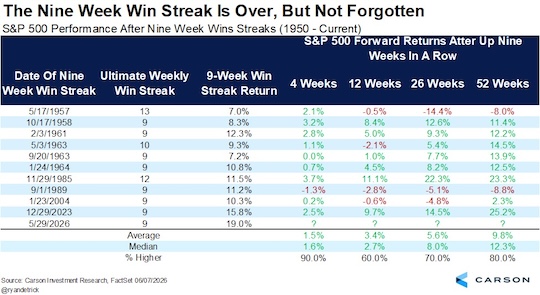
Source: Carson Group
The S&P recently came off a nine-week win streak, something that’s happened less than a dozen times since 1950.
In terms of percent gains, this one was the strongest. The index posted a 19% gain, beating out win streaks that lasted even longer.
In all but one case, the index was positive one month after the streak ended.
Stocks pulled back after the latest streak ended, but we’ve already seen a recovery. The S&P is right around the same level where its winning streak ended in late May.
Based on historical trends, we could see continued strength over the next two weeks.
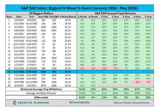
Source: Creative Planning
This table lists the S&P’s top 20 nine-week percent gains of the past 75 years.
As we saw in the last table, the S&P’s nine-week streak saw a 19% gain. That ranks it in 16th place.
You can see in the chart that stocks tend to keep going higher after a strong rally. Only once was the index lower in the following three, six, 12, and 24 months.
I would take that bet any day!
Even better, we see the index outperform after periods like this. We’re talking an average one-year gain of 24%, more than double the average return for all other periods.
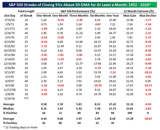
Source: Bespoke Investment Group
The S&P recently traded 5%+ above its 50-day moving average for an entire month. This has only happened 18 times before, the last time being in 2009.
It’s not unusual for the market to pull back in the short term after a period like this. The data here shows the S&P is down about half the time in the first week.
But in the longer-term, we see once again that the strength tends to build on itself.
The S&P was higher one year out 94% of the time, posting an average gain of around 17.5%.
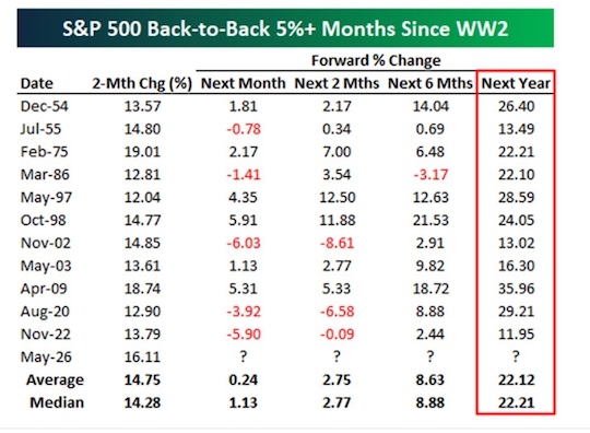
Source: Bespoke Investment Group
This table shows the performance of the S&P after posting back-to-back monthly gains of 5% or more, another rare feat.
The annual returns are in line with what the previous charts show. We’re looking at an average gain of 22% one year out.
But if you’re following closely, you’ll notice something different about this chart…
It’s the first one that shows the S&P positive 100% of the time in the next year. And the smallest gain was “only” 12%.
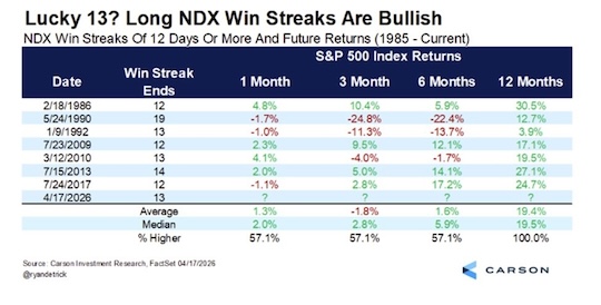
Source: Carson Group
This table looks at the Nasdaq and shows how it performs after posting a win streak of 13 days or more.
Including the most recent instance in April, that’s only happened eight times in the index’s entire history.
And without exception, it’s been higher one year later with an average gain of nearly 20%.
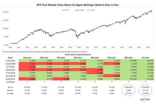
Source: Astra Insights
This next table is about the Bollinger Band, a popular tool that helps traders determine if stocks are over- or undervalued.
In May, the S&P 500 closed above the upper band for the first time in over a year. That’s another very rare signal.
When this has happened in the past, the index is up 100% of the time one year out for an average gain of almost 14%.
That may be on the lower end of the projected annual returns so far, but it’s still well above average.
And again, this is only one of dozens of technical signals. Now that brings me to one last indicator…
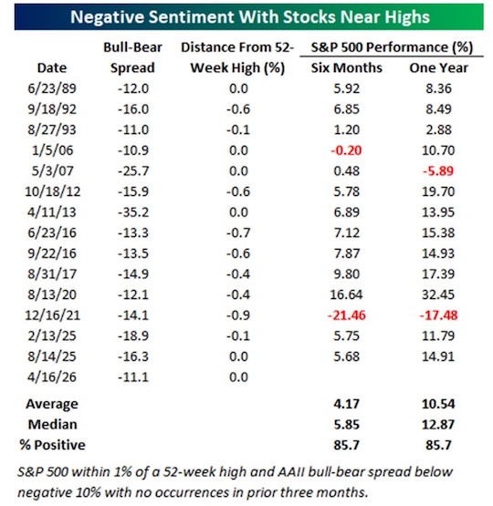
Source: Bespoke Investment Group
This one references the AAII Investor Sentiment Survey. As you can tell from the name, it tracks how individual investors are feeling about the market.
The table above looks at moments when the stock market was near all-time highs while investor sentiment was overall bearish.
When this has happened in the past, the market is up 85% of the time both six months and a year out.
By now, you should see a very clear message has emerged…
Strength Begets Strength
The kinds of technical indicators I’ve shown you today almost always come before a period of outperformance.
Sure, there are a few outliers. But when you consider all of these signals together, the evidence is overwhelming.
That’s why I firmly believe the market will be up significantly by this time next year. I’m talking a 1999/2000 melt-up scenario that will surprise folks.
We’ll almost certainly see some painful pullbacks between now and then. But these are likely just blips during a much stronger uptrend.
So I hope you’re ready to take advantage of what could be the best money-making opportunity in decades.
Sign Up Today for Free!
Truth & Trends brings you market insights and trading tips you won't find anywhere else — unless you have your own personal hedge fund manager on speed dial...
Meet Enrique Abeyta, one of Wall Street’s most successful hedge fund managers. With years of experience managing billions of dollars and navigating the highs and lows of the financial markets, Enrique delivers unparalleled market insights straight to your inbox.
In Truth & Trends, Enrique shares his personal take on what’s moving the markets, revealing strategies that made him a star in the world of high finance. Whether it’s uncovering the next big trend or breaking down the hottest stocks and sectors, Enrique’s insights are sharp, actionable, and proven to work in any market condition.
Inside these daily updates, you’ll gain:
- 50 years of combined trading wisdom distilled into actionable insights.
- A behind-the-scenes look at how Wall Street pros spot opportunities and avoid pitfalls.
- Exclusive strategies that Enrique personally uses to deliver exceptional returns — no fluff, just results.
To have Truth & Trends sent directly to your inbox every weekday, just enter your email address below to join this exclusive community of informed traders.
Don’t miss your chance to learn from one of the best in the business.
Sign up now and take your trading game to the next level.

The SpaceX Hangover Trade
Posted June 12, 2026
By Greg Guenthner

TOMORROW: Unleash the Cash Flood
Posted June 11, 2026
By Enrique Abeyta
Friday's Violent Sell-Off (It Changes Nothing)
Posted June 08, 2026
By Enrique Abeyta

Bitcoin Is Boring
Posted June 05, 2026
By Greg Guenthner

What History's Biggest IPOs Say About SpaceX
Posted June 04, 2026
By Enrique Abeyta