
Posted July 27, 2026

By Enrique Abeyta
Debunked: The Margin Debt "Crash Signal"
Investors are borrowing more money than ever to buy stocks.
Margin debt recently climbed to an all-time high of $1.5 trillion, and it’s growing faster than nearly any other point on record.
If you know anything about Wall Street history, alarm bells are probably going off in your head right now.
From the crash of 1929 to the dot-com bubble bursting, major stock market crashes have often followed periods of heavy borrowing.
But here's the thing...
While the data about margin debt making the rounds lately is accurate, that doesn't mean the stories people tell about it are necessarily true.
That's why I started a news series here at Truth & Trends called "Lies, Damned Lies, and Statistics."
The goal isn't to prove statistics wrong. It's to help you become a better investor by learning how to separate meaningful data from misleading data.
And this margin debt story is a perfect fit for the next installment of our series.
Today's Case Study
Before we go any further, let’s quickly define what we’re actually talking about.
Margin debt is money investors borrow from their brokerage firms to purchase stocks. There's nothing unusual about it.
Investors have used margin for decades to increase their buying power. When used responsibly, it can be an effective financial tool.
But like any form of leverage, it also magnifies risk. It can amplify gains during bull markets. And when markets decline, it can accelerate losses.
That's why investors pay attention to margin debt in the first place. If borrowing becomes excessive, market declines can intensify as leveraged investors are forced to sell.
So far, there's nothing controversial about any of this.
One of the most common ways margin debt is presented is by comparing it to U.S. gross domestic product (GDP).
Last week, I read an article by JC Parets of our affiliate, TrendLabs, titled "This Chart Is Designed to Scare You."
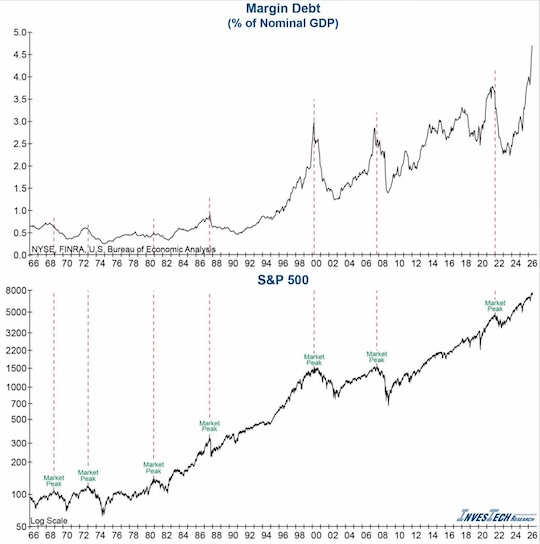
The chart in question tracks margin debt, measured as a percentage of GDP, and compares it to stock market peaks.
The message is pretty clear. Take a look for yourself.
 Source: InvesTech Research
Investors have borrowed too much money, and history suggests that a major market decline can't be far behind. Right?
If this were the only chart you saw, you might reasonably think that. But it’s not the right conclusion.
As JC pointed out, you need to ask whether margin debt is being compared to the right benchmark.
GDP measures the size of the U.S. economy. Margin debt measures money investors borrow to purchase stocks.
Both are legitimate statistics, but they're measuring two very different things.
If our goal is to understand whether investors have become excessively leveraged, wouldn't it make more sense to compare that borrowing to the value of the assets it's financing?
Let's see what happens when we do…
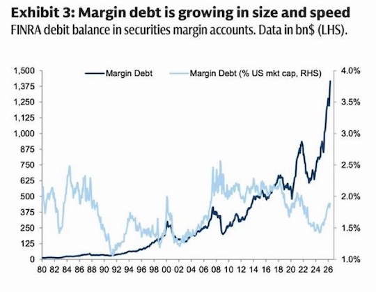
Viewed as a percentage of the U.S. stock market rather than the U.S. economy, the picture looks very different.
While investors are borrowing more dollars than ever before, the market itself has also grown dramatically over the past several decades.
Relative to the value of the assets being financed, margin debt remains well within its historical range and below several previous peaks.
So the statistic may not be wrong, but the benchmark is.
That's the central lesson here.
Why This Matters to You
You may think this is just a story about margin debt, but it isn't. It's about becoming a better consumer of information.
Every week, investors are presented with charts claiming stocks are overvalued, undervalued, expensive, cheap, euphoric, or dangerously overextended.
Some of those conclusions may ultimately prove correct. But before accepting any of them, we should first ask whether the comparison itself makes sense.
That lesson extends far beyond margin debt.
It applies to valuation metrics, inflation, housing prices, government debt, unemployment, productivity, and countless other statistics that shape investor sentiment.
So how can we separate meaningful data from misleading data?
Before making an investment decision based on a chart or statistic, ask yourself:
- What’s actually being measured?
- What’s it being compared against?
- Is that the most appropriate benchmark, or simply the most dramatic one?
- Would I reach the same conclusion if the data were presented differently?
Those questions won't predict the next bull market or bear market. But they can help you avoid making important decisions based on an incomplete story.
That's exactly what this series is about.
In future installments, we'll continue examining the charts, graphics, and eye-catching statistics that shape investor sentiment every day.
Some will reinforce conventional wisdom. Others may completely challenge it.
Either way, my objective remains the same: to help you cut through the noise, think more critically, and become a better investor.
Because at the end of the day, the best investors aren't the ones who memorize the most statistics.
They're the ones who know which statistics deserve to be trusted... and which ones deserve another look.
Sign Up Today for Free!
Truth & Trends brings you market insights and trading tips you won't find anywhere else — unless you have your own personal hedge fund manager on speed dial...
Meet Enrique Abeyta, one of Wall Street’s most successful hedge fund managers. With years of experience managing billions of dollars and navigating the highs and lows of the financial markets, Enrique delivers unparalleled market insights straight to your inbox.
In Truth & Trends, Enrique shares his personal take on what’s moving the markets, revealing strategies that made him a star in the world of high finance. Whether it’s uncovering the next big trend or breaking down the hottest stocks and sectors, Enrique’s insights are sharp, actionable, and proven to work in any market condition.
Inside these daily updates, you’ll gain:
- 50 years of combined trading wisdom distilled into actionable insights.
- A behind-the-scenes look at how Wall Street pros spot opportunities and avoid pitfalls.
- Exclusive strategies that Enrique personally uses to deliver exceptional returns — no fluff, just results.
To have Truth & Trends sent directly to your inbox every weekday, just enter your email address below to join this exclusive community of informed traders.
Don’t miss your chance to learn from one of the best in the business.
Sign up now and take your trading game to the next level.

Buy, Sell, or Hold: Every Mag 7 Stock
Posted July 24, 2026
By Greg Guenthner

The Iran Endgame, Revisited
Posted July 23, 2026
By Enrique Abeyta

The AI Trade's "Black Thursday"
Posted July 20, 2026
By Enrique Abeyta

3 "Stay-Away-From-Tech" Trades - TGT, INCY, SBUX
Posted July 17, 2026
By Greg Guenthner

The One Question I Ask Before Buying Any Stock
Posted July 16, 2026
By Enrique Abeyta
